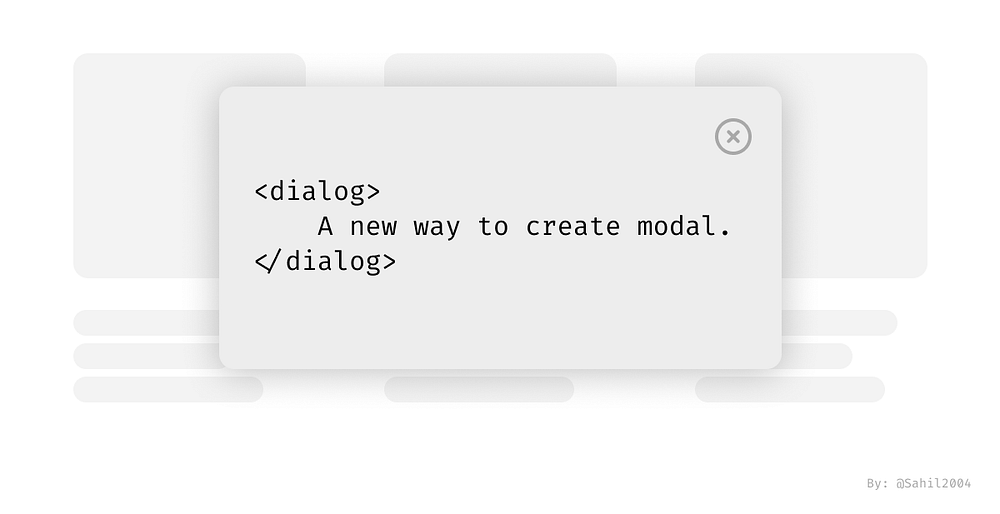
New way to create modals using HTML only
As HTML continues to evolve, the most used modal which were earlier implemented using JS have now gotten native support of HTML. It is completely game changer, as it now makes it a lot easier to implement Modals and popups without hacking the way into it.
New dialog element also has the support for all the JS methods we will need. Thus it can be completely customized. Let’s explore this more…
Browser Compatibility
Currently, it is supported in all the major browsers. Hence, we can implement immediately in our production sites.
Let’s get the basics down
A dialog/modal, is a popup that appears on a button click. To create it, we have the <dialog> HTML tag. But there is a difference between a dialog and a modal. Dialog is just a simple popup with content that takes up space on the page.
<dialog open>
<p>Greetings, one and all!</p>
<form method="dialog">
<button>OK</button>
</form>
</dialog>
This shows a dialog box.
The open attribute displays the dialog box. Without it, there would be nothing on the screen. This however isn’t a modal but a simple dialog box and doesn’t take the priority over screen.
Dual nature of Dialog
The new dialog in HTML shows dual nature based on how you use it. It can work as a modal, appearing on top of everything and in the center of the page. It can also work as a normal box appearing at the place it is opened at.
To control this functionality, dialog element has different methods to execute its different functionalities. To display it as a dialog we have dialog.show()
and to show it as a modal we have dialog.showModal()
.
As long as the dialog is open as a modal, all the other UI components become inert. The focus shifts to modal and when pressing tabs, the cursor rotates within the different HTML elements itself.
Designing the modal
When the modal opens, we mostly need to set the background of the modal to make user focus on the modal more than the rest of content. Usually we set it to a blurry black. This can now easily be done using ::backdrop
pseudo-selector.
Closing the modal or dialog: To close the modal, we have 4 methods — escape key, clicking an element with formmethod="dialog"
set inside the form, form’s method="dialog"
is set, or dialog.close()
.
Both the functionalities of the dialog element, as a modal and as a dialog is aptly displayed in the following example:
It is recommended, that you run this pen and tinker around and tweak the code to completely understand the dialog element.
Additional Details
- The dialog doesn’t make the elements in the background inert. It can be closed by a button in the body as well. This functionality is displayed in the pen.
- Dialog doesn’t need a
tabindex
. It means thattabindex
property must not be applied to dialog. - When the dialog opens, if it contains any element which can be focused, the first one gets autofocused if not stated otherwise or
autofocus
is not used with any other element.
Conclusion
Thus the new dialog element is a good addition to the HTML. It decreases the code required to implement the modals using JavaScript and also provides more accessibility to the element which is most common in today’s websites and apps.
If you came this long, you must have liked the post. I highly recommend you to follow to never miss learning new and unknown things in the domain of web development. You can always unfollow if you don’t like it in the future.
Let’s get connected on linkedin: https://www.linkedin.com/in/sahil2004/
I post such amazing content there as well.